King was born in Uganda and raised as a Canadian. He studied and graduated the animation program at sheridan college and furthered his knowledge into game and 3D artistry.
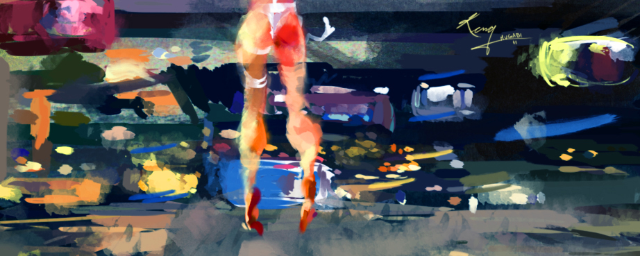
Quick seasonal romance commission I was coerced into completing over the weekend. I'm always up for playing the role of cupid.
Always been a fan of Marcos Chin's work and in this case I was very much influenced by his one piece. I wasn't given much liberty here I must say, but I gave it a slight personal touch. I hope it worked out for the love stuck individual.
After completing my Sabbatical into 3D. Taking a little time to use my 2D art skills before they fall into complete entropy, or was that atrophy, is a must. I need to brush up on the vocabulary as well. Back to my favorite past time, which includes watching visually engaging films with a pencil in one hand and a bowl of cereal in the other. Last night it was the Korean film Old Boy. It sells itself and if you haven't seen it I'm not going to put any effort into selling it. Several images stand out for me but none other than the hallway fight. For times sake, whatever I discuss here will mostly be on the visual side, story and all that will have to pass on this one.
People tend to make big deals out of singular takes these and I'm not even sure they know why. Mostly(but not always) it's backlash from they over edited sequences of popular film making. I find often times, that people treat singular takes as more than they are simply because of that fact. I, however don't really care how many cuts a sequence has as long as it's interesting. In some way's keeping fluid continuity during a sequence is at least twice as difficult when it's cut and stitched together. That being said, the cinematography(and editing) was pretty sweet in this. Also, tracking shots are always a good idea. A camera that moves with or along the action just makes everything all the more sweeter. CW-Park's direction has a very distinct marker for me. He cut's to a somewhat surreal image that looks frozen, and then there's movement. On top of the crazy context of this film, that style really pushed the imagery over the top for me. This was adapted from a manga comic and I appreciate that Par made the characters and scenery look as such.
As for the scene itself, it's just an interesting watch. Hard for anyone to turn away, it's so interesting. Very important; all the timing feels real. People aren't simply waiting their turns, and if they are it's cause they have to. Weather it be the lack of space or the fear they feel, it really works. To see some of the worst turn taking in the history of cinema, look no further than Dark Knight Rises, yikes. I also appreciate the respect of hthe characters fists, few films really convey what good strong boxing can do.When the knife goes in his back it just takes over the movie for me. Sorry, can't explain it.
I almost look forward to the Spike Lee remake if only to see him demonstrate where he actually stands next to a director like Park. David Fincher needed this film, Wolverine needed this direction...
Mother always said not to. She never said why though.
The concept here being an obvious one, taking an urban myth and mixing it with some kinetic energy and movement. Initially the kid had both hands on the couch with the remote in the air. I felt that gave me the highest n.r.g. to image ratio, but the communication didn't quite work. Not enough cause and effect.
Adding to my ongoing list of comic book character renditions. Here's my attempt at Spidey.
Me being me, I've put up a hand full of different images for one piece.
As much as I was digging the simple shapes, there came as time as there always does, when I decided to develop the work into something more accessible. I love the character because of how well his shapes work with his lines and how recognizable his iconic design is. The tear drop eye, the balance of two main colours, No matter how many times they change his costume design it usually takes a few months before they come back to what works.
The final in this case being a icy jazz setting with New York and it's character defining bridge in the background.
Adjective: Bad-tempered, argumentative, and uncooperative.
Always found the idea of retirement homes fascinating. A thing that only exists in the west I assume. These people raise their kids in their homes and then when it's time, the kids send them to a different home instead of returning the favor.
This piece is called Cantankerous and it's a story about an old war vet that is sent off to live with a bunch of his old war enemies. He literally still drives his beat up infantry truck everywhere, including right through the front gate. Not so original a concept I know but a great venue for caricature and cliche.
As satisfied as I am with the above composition, I decided it needed a fix along with some simplicity.
Sunset and water with a hint of Canada. The idea with this digital painting is two different skies separated by a center element which combines the two. I figured, why not the flag. In my mind it would be a wall piece that evokes a sense of travel.
Not much to say about this entry, the third movie Painting/Poster. It's been about a year or so since I did my boarding with bay bit Good Timesso I thought it only fitting I return to that style for this entry. I honestly love painting these characters, nothing has to be defined yet form is even more essential. Another movie series I miss not being a kid for.
with clouds
and here without
I Decided to skip the water colour brushes for this one. I actually didn't miss them all that much, however speed did suffer greatly. Looking back on these (three) pieces I regret not working on the lighting more. Perhaps the scale as well.
This last piece was from the boards I started then stopped when I got busy.
Just putting the new water colours to good use. There is a technique to water colouring, similar to marker work, it involves planning out which parts will be lightest and left untouched along with a hand full of other "rules." Coming from pastel junkie-hood I want nothing to do with that approach.
I have a few more of this coming along, This was the first and obviously the least creative.
In between projects I've found myself working on some personal art mostly inspired by movies. At this moment in time I'm exploring some water color brushes.
The first piece is called long life
The second piece is meant to contrast the first with a sense of peace, nature and a lady also approaching an ever expanding sun.
As of late, I've been viewing a lot of (Chris)Nolans work. His more recent work is growing on me. It's as if it gets better with time or a tleast repeat viewings. Anyways, one thing I loved right off the bat(see what just happened there) was his approach/direction with the Joker character. There are alot of good things to be said about the character's direction. For one; like Nolan, the character isn't funny and he's not supposed to be. Secondly he looks like a colourful version of The Crow. It's almost like he's returned from the dead to exact his revenge and for all intents and purposeses, he can't be killed/stopped. That's all for now.
I'm also feeling inception and this trailer mash up makes me smile a joker like expression.
This Zack Hemsey's Mind Heist works over any and every trailer you can imagine, even my very own....and believe me, I've got the exports to prove it.
Keeping with my run on digital comic book renderings, my second attempt is one of the Hulk. I've always had some thoughts on his ins and outs but I've never once put pen to pad. In what started out as a mission to "design" the hulk turned into a rather generic but enjoyable rendition. I found many paint streams along the character's vast canvas that have inspire me to really figure digital painting and its advantages. I worked on lighting(which is always the goal), and I found a piece to finally round out my banner.
Similar to the design forethought in Tarzan, I believe it prudent to design superheroes for their function. They shouldn't all look like swimmers that have too much time on their hands. Hulk, who has gamma radiation juicing up his muscle fibres should have a crazy physique, however there is still room for speculative function. I believe that his centre is his upper back. Everything he does from opening doors to smashing mountains is with his traps, and adductors. However, I must admit I'm very dissapointed by how generic this piece turned out, yet there is always something to be said for drawing on model.


 -King
-King