About Me

My photo
King was born in Uganda and raised as a Canadian. He studied and graduated the animation program at sheridan college and furthered his knowledge into game and 3D artistry.

Content

Scene Stealing #2

0 comments
The Master.


Why this flilm?
Simply put, I liked the look, not much more.
Pretty much the only thing that I took away from this one was the photography. Similar to Pear Harbor(soo pretty) it looked like a glamorous moving calender cut out of that genius looking 40-60 period in the west. From the cuffed jeans and white shirts to the red lipstick and the contrast filtered color grading.


A few scenes stand out, particularly the opening bit with the boating and of course the desert strip motorcycle sequence. Phillip S Hoffman is always such a captivating character actor...I wouldn't mind him showing up in every movie.


As for the movie. I'm not a fan. Reminds me of Catcher in the Rye. No matter how many times I tried to read that at the time, I just didn't get it. Maybe in a few years...


-King
Read more »

Cupid's pen

0 comments

Quick seasonal romance commission I was coerced into completing over the weekend. I'm always up for playing the role of cupid.

Always been a fan of Marcos Chin's work and in this case I was very much influenced by his one piece. I wasn't given much liberty here I must say, but I gave it a slight personal touch. I hope it worked out for the love stuck individual.

-King
Read more »

Dianna Agron Portrait

0 comments

 ...haven't done one of these in a while


One of my goals with this was a pink fleshy palette. I read somewhere that argons colors were pink and purple (I read a lot of stuff actually, I couldn't stop), so I looked to one Andy Warhol for guidance on how to get this done. Pushing this flat bold style I found a base that I could build off of. Thankfully Dianna’s hair is blonde so I knew I’d have a good balance going in.


I watch a good amount of makeup tutorials (I love em). I personally have mixed feelings on the face painting rituals many young women are now a slave to committing to on the daily. For example, why do they have to worry about extenuating features to "look their best," whilst I as a male do not? And once they commit to it once, not doing is must feel like walking around at a disadvantage. Imagine world with no boys, would you still apply make up? I’m sure some would, but not all. I'm under the suspicion that we have the Egyptians to thank for this. On the flip side, I've learned that a lot of the principals of make up (cosmetic or otherwise), are the very same principles I've self taught myself with all these portraits. I even apply my paint the same way. This was made no clearer to me than when I decided to really push the make up in this portrait. Smoky eyes with liner and rose cheeks over high cheekbones. I'm pretty confident I could apply a lady friends make up at this point. Anyways Agron's features are so lovely, if anything the make up takes away form her looks. In fact, this style of eyeliner really hurts or rather, messes with my ability to capture likeness.


Paint streams. It's like a painters signature. A lot of people try to hide them for the sake of realism, I say embrace them, or rather find a happy compromise. Use them to make an interesting composition that guides the audience up down and all around. For me it's not so much about the realism as it is about the stamp.
You know I've got some free time when I do one (or two) of these. I never realized how much time and effort it takes to pull one off, video and blog included. Then again, as I get older it seems my time gut’s more precious. DIANNA AGRON. I don't have the vocabulary to really express all the ways...so I'll leave it at that. Also, I love her naturally sultry eye shape...her voice sounds like my pillow.


A little video from glee of Dianna doing her thing, for those who have no idea.


On another note, new (well to me anyways) research in neural plasticity suggests that if we don't use neural functions, as we get older we'll loose them. This goes a way to explain some of the behavior we find in many older people. If the brain's neural pathways were a stream with many branches, than as one stream's use decreased, so to does the space allotted to it till it’s eventually closed off entirely to make room for the paths with higher demand. One of these very paths is the ability to learn itself. For example if you're not using math all that often, you'll probably notice that you're not as good at it as you once were, this isn't just a case of being rusty, but rather a form of neural housekeeping. Same goes for language, motor skills etc. You're not just forgetting how to do things; you're loosing your ability to do them. Long story short, if you've got a talent that you love, use it or loose it. Myself, I have a few, and I'm changing my life so to better their continual use, and I suggest you do the same. Again, long story short, more portraits, more writing, and more filmmaking, all the 3D I just learned had some serious RAM requirements. Also, thanks for reading all this, I like to think people visit this place for more than just the kick ass, brilliant art, it's a package deal.

Next up:
Justin, Audrey and Andy.... not in that order. But first, some Story Boarding.

-peace
Read more »

Scene Stealing #1 Old Boy

0 comments

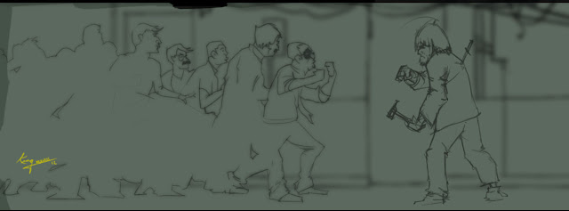
After completing my Sabbatical into 3D. Taking a little time to use my 2D art skills before they fall into complete entropy, or was that atrophy, is a must. I need to brush up on the vocabulary as well. Back to my favorite past time, which includes watching visually engaging films with a pencil in one hand and a bowl of cereal in the other. Last night it was the Korean film Old Boy. It sells itself and if you haven't seen it I'm not going to put any effort into selling it. Several images stand out for me but none other than the hallway fight. For times sake, whatever I discuss here will mostly be on the visual side, story and all that will have to pass on this one.


People tend to make big deals out of singular takes these and I'm not even sure they know why. Mostly(but not always) it's backlash from they over edited sequences of popular film making. I find often times, that people treat singular takes as more than they are simply because of that fact. I, however don't really care how many cuts a sequence has as long as it's interesting. In some way's keeping fluid continuity during a sequence is at least twice as difficult when it's cut and stitched together. That being said, the cinematography(and editing) was pretty sweet in this. Also, tracking shots are always a good idea. A camera that moves with or along the action just makes everything all the more sweeter. CW-Park's direction has a very distinct marker for me. He cut's to a somewhat surreal image that looks frozen, and then there's movement. On top of the crazy context of this film, that style really pushed the imagery over the top for me. This was adapted from a manga comic and I appreciate that Par made the characters and scenery look as such.

As for the scene itself, it's just an interesting watch. Hard for anyone to turn away, it's so interesting. Very important; all the timing feels real. People aren't simply waiting their turns, and if they are it's cause they have to. Weather it be the lack of space or the fear they feel, it really works. To see some of the worst turn taking in the history of cinema, look no further than Dark Knight Rises, yikes. I also appreciate the respect of hthe characters fists, few films really convey what good strong boxing can do.When the knife goes in his back it just takes over the movie for me. Sorry, can't explain it.

I almost look forward to the Spike Lee remake if only to see him demonstrate where he actually stands next to a director like Park. David Fincher needed this film, Wolverine needed this direction...

-King
Read more »

3D anim assignment dump

0 comments

A couple of 3Ds Max animation assignments I'm finally getting around to posting now that I'd have some time to fiddle with them. Game design is wonderfully hard and filled with many different avenues, yet I find myself most at enjoying the animation aspects. Sadly, that means it will receive the least of my time from now on. At any rate here are two of our early assignments I managed to collect. The first being the rudimentary ball and tail exercise, somehow i manged to twist it into a superman themed scene.


The concept is simple enough, Superman is all about the phone booths and he's also all about leaping "tall buildings" in a single bound. Animating a character without any sort of rig is a rare opportunity I think. I did what I could.


 The second, a rigging assignment layered onto a modeling assignment from another class topped with animation. Modeled a shark from scratch(no teeth), built the bone system from scratch, skinned the mesh to the bones then animated. Every problem I could have encountered I did. Curse those orient constraints. For the final comp I grabbed the layout from the super-ball assignment and tossed the whole thing under the sea to the tune of Donkey Kong Country(Game Design).


I'll be sure to post more of these visually accessible assignments when I can.
-King
 
Read more »

Representing District 09 in the Hunger Games

0 comments


I found the time to sketch this piece in during a particularly long render wait. It's self explanatory. A prawn from district 9 marked as tribute. Considering Hunger Games is all about poor districts, there is no district more impoverished than the South African ghetto occupation of District 9.


As for the Hunger Games as a film. I found the first half was very well made, however, the second half was completely amateur, and the ending was a cop-out and incomplete. Why more films don't go the Shawshank route and translate their voice over material from the original work is big prideful waste by my estimation and it hurt this story. Even the first Twilight had the good sense to keep it. I notice in every review, fan or otherwise, people are outlining issues that would have easily been resolved if they had simply gone this route. Starting with both the love interests and the little girl companion. Peeta not receiving any help from their mentor and how he felt about that was always interesting in the novel, sadly, there's no mention in the film. The books greatest accomplishment for me is that the same ploy used to win the protagonist some sponsors and sympathy is also deployed on we the audience. Haymitch chooses to focus on Everdeen because audiences love to route for females in love. Everdeen uses this until the lines are blurred and then in the end she blindsides all of us. The movie does something strange with this and to be honest I'm not sure if Gary Ross himself knows exactly what. And the villains, my goodness the villains(sucked that is). In the end it was an engaging film. Lawrence was great, everyone was actually, everyone but Woody Harrelson that is. I still would have liked to see Hailee Stanfield in the role personally.

It's a crime how far and in between the updates have been on here this year. However, that just means I'm busy, which is always a good thing(for me). I've got a lot of things going on at the moment and I've had to push my personal projects schedule back a year. Big plans though, stay tuned.
Read more »

Zack Snyder Watchmen Analysis (video)

0 comments

Been busy with work and haven't had a chance to upload any art worth uploading. Plans are being planned however. In the meantime I quietly work on my various film projects and pitches(yes) well into the darker hours of the night. I figure that's no excuse to embargo my presence from my humble blog space. Whist I prepare some future posts I wanted to share this awesome video analysis I happened upon not too long ago. A youtube user by the name of 2finnman has compiled a concise yet brilliant and insightful visual analysis of the 2 opening sequences to the film Watchmen.


I love it. Lots to learn and what's more, he really highlights the good work of Zack Snyder, a visualist, who is often underrated. Often due to someone who's either butt hurt that he touched their material and made it accessible or someone pushing some sort of agenda, or both. The film itself while not without it's flaws was a very enjoyable experience for me.Superheros in the real world being people with social problems putting on costumes in order to feel important. What I really enjoy about these vids is that they are completely dedicated to a technical analysis and thus I find them refreshing.

I surely hope this 2finn uploads more of this work, I'd love to see more.


You'll have to catch the rest at the source do to embed restrictions, it's worth it though. Part 2

Check this space soon
-Peace
Read more »

Nicki Minaj Portrait

1 comments

 Haven't done one of these in a while. 

Too busy not just with work but with a different nature of work. However that did stop my brother from all but threatening my life last week. Apparently he was off to meet miss Minaj at her first Toronto show date by wa of a little back stage meet and greet. I figured of all the reasons to do one of these, the celeb in question seeing the work in person would be one of them. It's been a lot of months since I went through the process and that's never good with any skill task. I literally had to sit down and watch some of my old videos to re-learn the procedure and of course try to improve upon it. What I did learn is that I must have been an idiot savant because it used to be so easy whereas  it's mostly painstaking now. Moreover, low angles are never fun because the proportions and likeness curves are thrown way out of whack. Still there is that split second where I find peace(of mind) because it comes together and all that stress was for not.


I let the dude decide which hair style to give her, I deferred to his opinion for most of the decisions and I was probably done in half the time because of it. I think I'll give Nicki another go just to really capture her crazy stare with funky hair. 
The focal point in this piece is the lips I think. Similar to my Tupac I give them the that extra "i don't know what" 


Lighting gave way to flesh tone on this one, mainly because my brother wanted to "play it safe." Coloured folk have the hardest skin tone to nail perfect but at the same time you can get away with a wider range of tones. I remember my painting professor would always get on me to add purple. I never really cared for the approach but in this instance the lighting really re-enforced it.

My brother bought a new slr a little while ago so I'm slowly finding more and more ways to incorporate it in my my work.  When I learn to speed up the process I may even do one of these vids live.

Time Lapse speed painting featuring Minaj and done with pastel.


I might do a few more in the coming months, stay tuned.
-King

Read more »

Too Close to the TV

0 comments

Mother always said not to. She never said why though.
The concept here being an obvious one, taking an urban myth and mixing it with some kinetic energy and movement. Initially the kid had both hands on the couch with the remote in the air. I felt that gave me the highest n.r.g. to image ratio, but the communication didn't quite work. Not enough cause and effect.

The Final


-King
Read more »

Search

Powered by Blogger.

About Me

Popular Posts

Contact Me

marvin_mugabi@hotmail.com

Followers